Farewell Editorial: Tara Holley, Art & Multimedia Editor
The Science Writer’s founding Art and Multimedia Editor reflects on the visions and design of the magazine
June 30, 2023
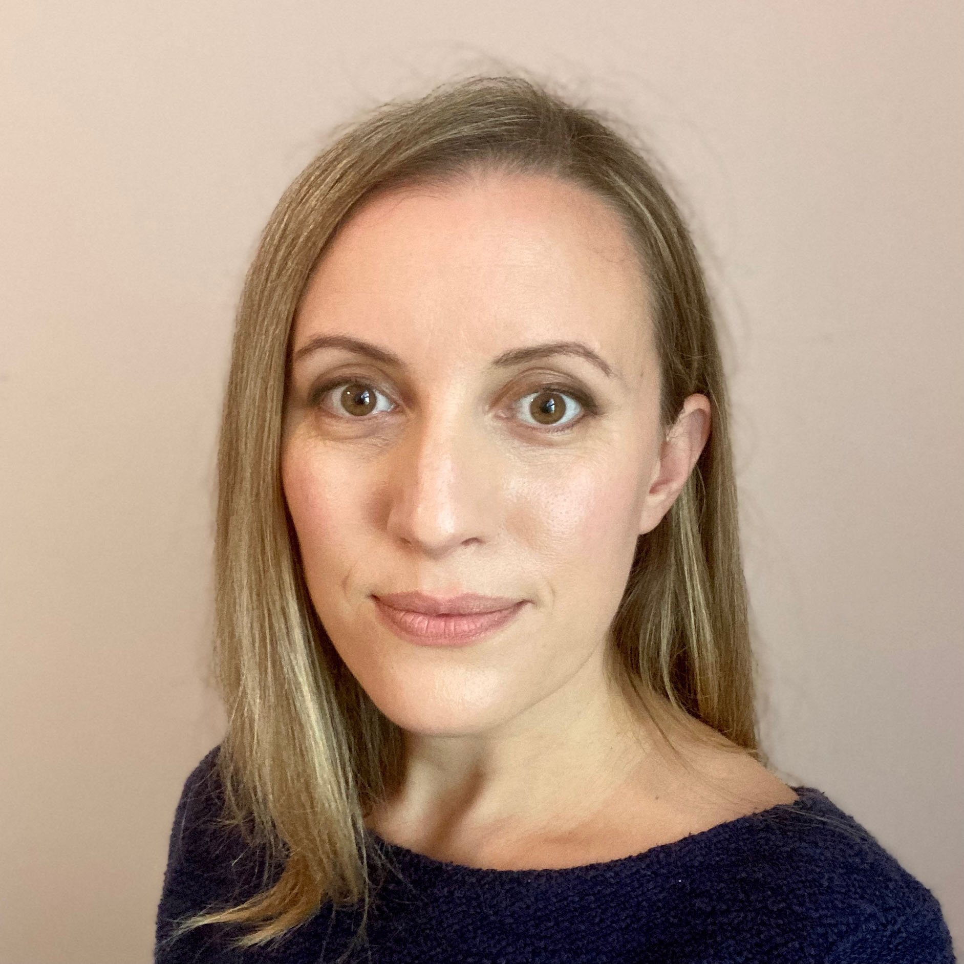
Tara Holley, TSW Art and Multimedia Editor (2021-23)
“The blank page. We’ve all been there. Even the most imaginative creator can look at a white sheet and feel a slight sense of dread waiting for that first spark of inspiration to fill the space. Now imagine that one sheet is a stack of papers piled on top of one another. You need to fill it well, fill it fast, fill it all. That’s what the early days of The Science Writer felt like.
The design team was tasked with the initial decisions that would shape the appearance of the magazine for issues to come. Not only the website’s look and feel, the accompanying images and infographics, but also the logo, the brand, and color schemes. Visually speaking should it lean conceptual like Quanta? Iconographical like National Geographic? To be new, do you need to be different?
We hadn’t yet decided what we wanted to be, but we knew what we didn’t. Even top-tier magazines, brimming with masterful reporting and elegant writing, often resort to stock imagery from Getty Images or the like. It’s the nature of a fast-paced news cycle. You have an hour to grab an image, not a month to craft one. But in a sea of breaking news, commentary, and opinion pieces, could an unexpected illustration set us apart? Would something visually novel grab a potential reader for a moment longer? Besides, for our writers that often laid themselves bare on the page, should the visuals feel like an afterthought?
Customization became the design team’s mantra. While the writers and editors mulled over the use of a comma or dash we debated between fonts, serif or sans. They adjusted the language to make the stories more dynamic, we tweaked colors to make the website more vibrant. Each image was crafted to set the stage even before you read the headline, like watching the first frame of a movie trailer. Eventually, we poked our heads out from the weeds and found our footing, settled into our tone, and adopted a signature style. Our design philosophy could be summed up as this: high contrast, atmospheric, slightly cinematic, with a touch of retro-futurism.
For me, this time, marked by a flurry of decisions, coalesced around a central concept -- the issue’s theme image. Uncharted’s capstone image reflected the theme’s broader message: the promise and uncertainty of the unknown. The human looks into the tunnel, or perhaps outwards into an unexplored reality. The central figure — intentionally anonymous, genderless, ageless — became a fixed point, an anchor of sorts. They are a wanderer, an explorer, an examiner of the world.
With the design infrastructure firmly in place, space opened to experiment with ideas. Writers like Megan Rechin and Mark Jordan provided their own excellent photography. Others, like Mal Cole, created a compelling original illustration. Images embraced not just static objects, but entire concepts and stories. One of my favorites, Sarah Donahue’s A Continued Note on Silence, examines her account of selective mutism. I created the accompanying image, a spectrum of scaled, silent profile views, not to capture the condition but her evolving experience. As time went on animations replaced still images, infographics became interactive. With the writers' visions in mind, we created multimedia stories and videos. With each click, view, and listen the reader, much like the figure, became an integral part of the process: wandering, exploring, examining the page. We wanted you to feel a gust of cold Alaskan air, discern the intricacies of an ovarian cell gone awry, and become entranced with a looping reel of seaweed swaying in the tide.
Today, I’m looking at the website as we prepare to launch our next issue, Enigma, my final as the art and multimedia editor. The white page from two years ago radiates with color. It’s a testament to what’s possible with collective effort and vision. The anonymous figure makes a final appearance as well. Their face is surrounded by examples of human inquest and inquiry through the ages: ancient star maps, the earliest computer programming calculation, a drawing of a radium atom, NASA’s charting of the Kepler system. These ‘known’ elements contrast with the bright, central spot on the page — our explorer. Are they human, AI, a symbol of consciousness, or something else entirely? That’s up to you to decide.” — Tara Holley
Tara Holley is a freelance science writer, editor, illustrator, and animator based in Richmond, Virginia. Prior to her career in science communications, she spent ten years as a genomic researcher working on high profile projects such as Stand Up to Cancer and the Human Genome Project. She’s excited to combine her love of art and science to foster a greater understanding of the world around us. She graduated from the Johns Hopkins University Science Writing Program in 2018. To view more of her work visit www.taraholleycorrigan.com.

